An SVG icon that looks perfectly clear on screen can be completely silent, or worse, confusing, to someone using a screen reader. Unlike an <img> tag, which has one well-understood alt attribute, an inline SVG is a small piece of markup with its own internal structure, and browsers and screen readers have specific rules for which parts of that structure actually get announced. This guide walks through exactly what to add, and what to deliberately leave out.
<title>gives an SVG its accessible name;<desc>adds optional longer context<title>only works when it's the first child element inside the<svg>tag- Decorative SVGs should be hidden with
aria-hidden="true", not given a title role="img"tells screen readers to treat the SVG as one image, not a set of shapes<title>and<desc>inside an SVG file are ignored when that file is loaded via<img src="...">
Why SVG Accessibility Isn’t the Same as Image Alt Text
When a browser encounters <img src="icon.svg" alt="Search">, the rule is simple: the alt attribute is what gets announced, full stop. Whatever accessibility markup exists inside icon.svg itself is irrelevant in that context, because the browser treats the whole file as a single opaque image, the same as it would a PNG or JPEG.
The moment that same SVG is inlined directly into the HTML as an <svg>...</svg> element, the rules change completely. Now the browser exposes the SVG’s actual internal structure to the accessibility tree, and it’s the SVG’s own markup, specifically <title>, <desc>, and any role or aria-* attributes, that determines what gets announced. Running a source file through the SVG Viewer & Validator first is a good habit here too, since malformed markup can behave unpredictably once it’s parsed as live DOM rather than treated as an opaque file.
<title>: The Accessible Name
<title> is the closest SVG equivalent to alt text, and it’s the single most important tag for making an icon accessible. It has one strict requirement that trips people up constantly: it must be the first child element inside the <svg> tag, or many screen readers won’t pick it up at all.
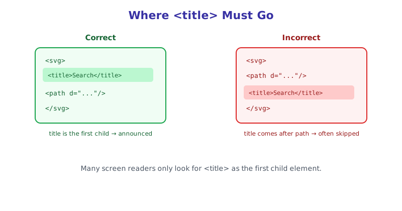
<title> placed after other elements is often silently ignored by assistive technology.<svg viewBox="0 0 24 24" role="img" aria-labelledby="search-icon-title">
<title id="search-icon-title">Search</title>
<path d="..."/>
</svg>Pairing <title> with role="img" and aria-labelledby pointing at its id is the most broadly reliable pattern, since it doesn’t rely on every screen reader correctly inferring the accessible name from <title> alone.
<desc>: When a Short Name Isn’t Enough
<desc> exists for cases where <title> alone can’t carry enough information, most commonly complex data visualizations, diagrams, or illustrations where a sighted user would spend several seconds visually parsing what’s happening. A simple icon almost never needs one.
<svg viewBox="0 0 400 300" role="img" aria-labelledby="chart-title chart-desc">
  <title id="chart-title">Quarterly revenue growth</title>
  <desc id="chart-desc">A bar chart showing revenue increasing from $2M in Q1 to $3.4M in Q4, with the steepest growth between Q2 and Q3.</desc>
  <!-- chart paths -->
</svg>
Notice aria-labelledby references both IDs here, space-separated, so the accessible name and the longer description are both exposed together rather than one silently overriding the other.
Decorative SVGs: When to Hide Them Instead
Not every SVG should be announced. An icon sitting directly next to visible text that already says the same thing, like a small arrow inside a “Learn more →” link, adds nothing by being read aloud a second time, and often just creates redundant noise for someone navigating by screen reader.
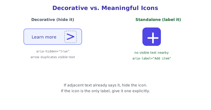
<a href="/learn-more">
  Learn more
  <svg aria-hidden="true" focusable="false" viewBox="0 0 24 24">
    <path d="..."/>
  </svg>
</a>
aria-hidden="true" removes the SVG from the accessibility tree entirely, and focusable="false" is worth adding too, since older versions of Internet Explorer and Edge made SVGs keyboard-focusable by default, which could otherwise create an empty, unlabeled stop in the tab order.
Icon-Only Buttons: A Special Case
A button that’s only an icon, with no visible text, is the case most likely to actually break for screen reader users if accessibility markup is skipped. Here, putting the label directly on the parent control is usually more robust than relying on the SVG’s internal <title>:
<button aria-label="Close dialog">
  <svg aria-hidden="true" focusable="false" viewBox="0 0 24 24">
    <path d="..."/>
  </svg>
</button>
This way, the SVG itself is marked purely decorative, and the accessible name comes from the aria-label on the button that actually receives focus, which is a pattern supported consistently across every major screen reader.
Checking Your Work
Manually eyeballing SVG markup for these patterns across a whole icon set is tedious and easy to get subtly wrong, especially the <title>-must-be-first-child rule. The SVG Accessibility Checker scans pasted SVG markup for exactly these issues, flagging missing or misplaced <title> elements, decorative icons that aren’t hidden, and icons missing role="img", so you can catch it before it ships rather than after a user reports it.
The short version
Accessible SVG markup comes down to a small set of consistent rules: give meaningful standalone icons a <title> as the very first child element, paired with role="img" and aria-labelledby; reserve <desc> for genuinely complex graphics that need more than a short name; and explicitly hide purely decorative icons with aria-hidden="true" rather than leaving them to be announced as noise. Remember that none of this applies when an SVG is loaded through <img src="...">, since the alt attribute takes over entirely in that case. Run your icon set through the SVG Accessibility Checker to catch placement mistakes automatically.