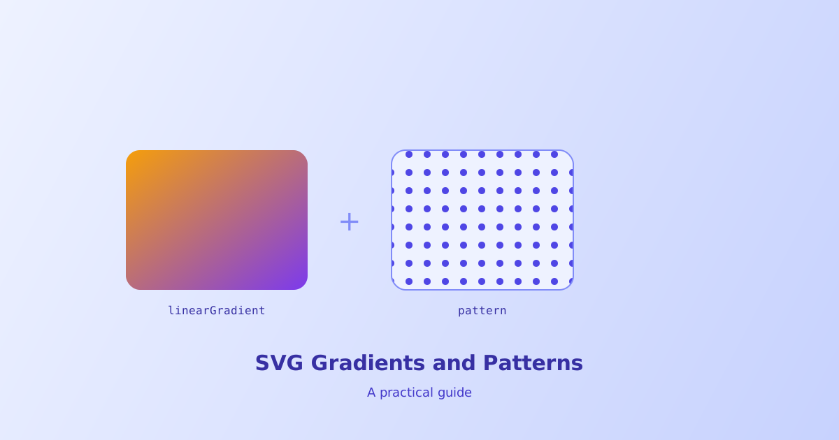
Filling an SVG shape with a flat color is one line of code. Filling it with a smooth gradient or a repeating pattern takes a bit more structure, since both are defined as their own elements first and then referenced, rather than written inline the way a CSS background gradient is. This guide covers the syntax for both, along with the details that trip people up most, like why a pattern won’t tile or why a gradient looks different on two different shapes.
- Gradients and patterns are defined once inside
<defs>and referenced by shapes withfill="url(#id)" <linearGradient>transitions along a straight line;<radialGradient>transitions outward from a center point- A pattern's
widthandheightmust match its content's actual size or tiles will overlap or leave gaps - By default, gradient coordinates are relative to each shape's bounding box, so the same gradient can look different on different shapes
- The same gradient or pattern definition can be reused across as many shapes as needed without duplicating it
The Core Pattern: Define Once, Reference with fill
Both gradients and patterns follow the same two-step structure in SVG. First, the gradient or pattern is defined as its own element, usually tucked inside a <defs> block so it doesn’t render on its own, and given an id. Second, any shape that should use it sets its fill attribute to url() wrapped around that same ID.
<svg viewBox="0 0 200 200">
  <defs>
    <linearGradient id="sunset" x1="0%" y1="0%" x2="100%" y2="100%">
      <stop offset="0%" stop-color="#F59E0B" />
      <stop offset="100%" stop-color="#7C3AED" />
    </linearGradient>
  </defs>
  <rect width="200" height="200" fill="url(#sunset)" />
</svg>
This indirection is what makes gradients reusable. The SVG Gradient Generator builds this exact structure visually, letting you drag color stops and preview the result before copying the markup out.
Linear Gradients: Direction and Color Stops
A <linearGradient> transitions color along a straight line, whose angle is set by its x1, y1, x2, and y2 coordinates. Each <stop> inside it marks a color at a given point along that line, using offset as a percentage from start to end.
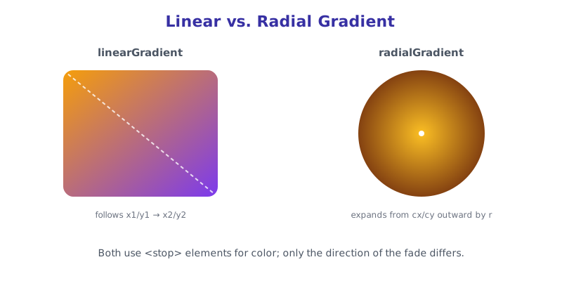
Two stops give a simple fade, but any number can be added for a multi-color transition, for example a rainbow bar would just add more <stop> elements at evenly spaced offsets. The x1/y1/x2/y2 coordinates default to a horizontal left-to-right fade, so a diagonal or vertical gradient needs those explicitly changed, as in the sunset example above going corner to corner.
Radial Gradients: Center, Radius, and Focal Point
A <radialGradient> works the same way structurally, but transitions outward in a circle instead of along a line, controlled by cx, cy, and r for the center point and radius.
<svg viewBox="0 0 200 200">
  <defs>
    <radialGradient id="glow" cx="50%" cy="50%" r="50%">
      <stop offset="0%" stop-color="#FBBF24" />
      <stop offset="100%" stop-color="#78350F" />
    </radialGradient>
  </defs>
  <circle cx="100" cy="100" r="90" fill="url(#glow)" />
</svg>
Shifting cx and cy off-center, or adding fx and fy for a separate focal point, is how a lens-flare or spotlight effect gets built, since the brightest point of the gradient no longer sits in the exact middle of the shape it’s filling.
Patterns: Repeating Tiles Instead of Color Fades
A <pattern> fills a shape by repeating a small tile of content across it, rather than blending colors. The pattern element defines a tile’s size and content, and like gradients, is referenced by a shape’s fill attribute.
<svg viewBox="0 0 200 200">
  <defs>
    <pattern id="dots" width="20" height="20" patternUnits="userSpaceOnUse">
      <circle cx="10" cy="10" r="4" fill="#4F46E5" />
    </pattern>
  </defs>
  <rect width="200" height="200" fill="url(#dots)" />
</svg>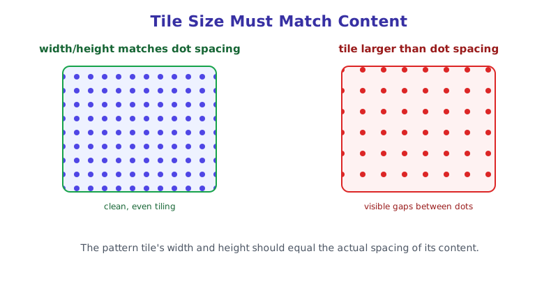
The most common mistake here is the tile’s width and height not matching the actual size of what’s drawn inside it. In the example above, the tile is 20 by 20 and the dot sits centered within that space, so tiles butt up cleanly against each other. Shrink the tile to 15 without adjusting the dot’s position and the dots start overlapping between tiles; grow it to 30 and visible gaps appear. The SVG Pattern Generator handles this math automatically and previews the tiled result live.
Bounding Box vs. Fixed Coordinates
By default, both gradients and patterns use objectBoundingBox units, meaning their coordinates are expressed as a fraction (0 to 1, or a percentage) of whatever shape is using them. That’s convenient for a gradient meant to look the same proportionally on any shape, but it also means the same gradient definition will visually stretch differently on a tall rectangle versus a wide one.
Setting gradientUnits="userSpaceOnUse" (or patternUnits="userSpaceOnUse" for patterns) switches to the SVG’s actual coordinate system instead, so the gradient or pattern has a fixed position and size regardless of which shape references it. This matters most when the same gradient needs to look visually consistent across several differently shaped elements, like a background wash that should stay put behind multiple overlapping shapes.
The short version
Gradients and patterns in SVG both follow the same structure: define them once inside <defs> with a unique id, then reference that ID from any shape’s fill attribute using url(#id). Linear gradients transition along a line set by coordinates, radial gradients transition outward from a center point, and patterns repeat a small tile of content rather than blending color at all, with tile width and height needing to match the content inside for clean, gapless tiling. Build both visually with the SVG Gradient Generator and SVG Pattern Generator rather than hand-tuning stop offsets and tile dimensions by trial and error.