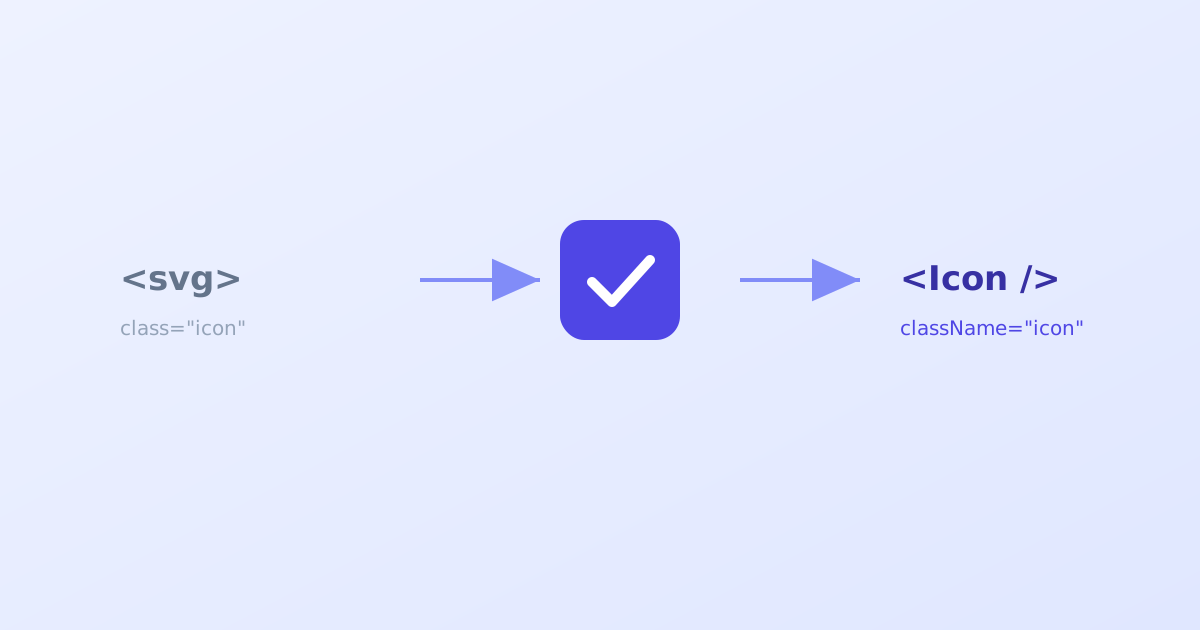
Pasting raw SVG markup straight into a React component almost works, right up until React throws a warning about an unrecognized DOM attribute, or a TypeScript error about a style prop that isn’t the shape it expects. None of the individual fixes are hard, but there are enough of them, and a couple of real gotchas, that it’s worth walking through properly once rather than fixing the same warnings from memory every time. This guide covers the actual conversion, step by step, along with what an automated tool is really doing when it does this for you.
- Most SVG attributes just need kebab-case turned into camelCase, and class renamed to className.
- aria-* and data-* attributes are the one deliberate exception. They stay exactly as written.
- An inline style string has to become a real object for JSX, not just have its quotes changed.
Why raw SVG doesn’t just paste into JSX
JSX looks like HTML but compiles to JavaScript, and it follows JavaScript’s rules rather than HTML’s. class becomes className because class is a reserved word in JavaScript. A hyphenated attribute like stroke-width becomes strokeWidth because a bare hyphen in that position would be read as subtraction, not part of an identifier. None of this is arbitrary. It’s a direct consequence of JSX being JavaScript syntax wearing HTML’s clothes.
Step 1: Start with the raw SVG
Here’s a simple checkmark icon, the kind of thing you might export from a design tool or grab from an icon set:
<svg xmlns="http://www.w3.org/2000/svg" viewBox="0 0 24 24" fill="none" stroke="#4F46E5" stroke-width="2" stroke-linecap="round" stroke-linejoin="round" class="check-icon">
  <path d="M20 6L9 17l-5-5" />
</svg>
This is valid SVG and would render fine dropped directly into an HTML file. Pasted as-is into a JSX return statement, it will cause warnings the moment React tries to reconcile class, stroke-width, and stroke-linecap against its known set of DOM properties.
Step 2: Rename class to className
The most familiar one first:
- class="check-icon"
+ className="check-icon"
Step 3: Convert kebab-case attributes to camelCase
Most of the remaining changes follow one consistent rule: split on the hyphen, capitalize the following letter, remove the hyphen.
- stroke-width="2"
+ strokeWidth="2"

- stroke-linecap="round"
+ strokeLinecap="round"

- stroke-linejoin="round"
+ strokeLinejoin="round"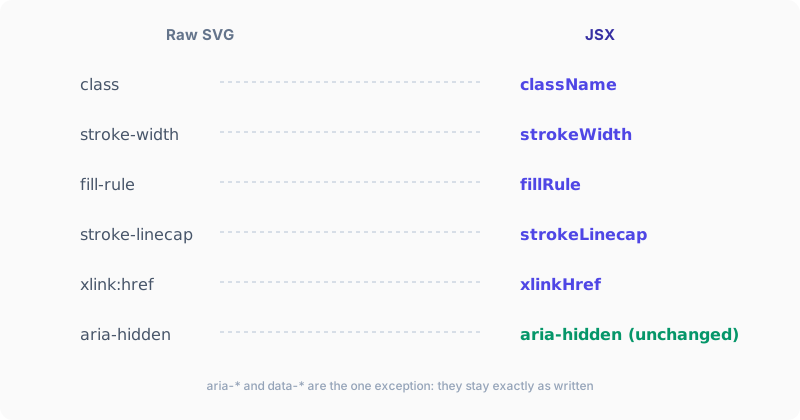
Worth noting: many SVG attributes are already camelCase in the source spec, like viewBox and preserveAspectRatio. Those don’t need touching at all. Only the genuinely hyphenated ones (fill-rule, clip-rule, stroke-dasharray, font-family, and a handful of others) need converting.
Step 4: Leave aria-* and data-* attributes alone
This is the one real exception to the rule above, and it’s easy to get wrong if you’re applying the camelCase pattern automatically without thinking about it. React deliberately keeps aria-* and data-* attributes in their original hyphenated form:
<svg aria-hidden="true" data-testid="check-icon">stays exactly as written in JSX. Converting these to ariaHidden or dataTestid would actually be wrong here, not just unnecessary.
Step 5: Convert an inline style string to an object
If the SVG has an inline style attribute, it needs more than a rename. JSX’s style prop specifically expects a JavaScript object, not a string:
- style="color: red; font-size: 12px"
+ style={{ color: 'red', fontSize: '12px' }}
Each CSS property name inside the object also gets the same kebab-to-camelCase treatment (font-size becomes fontSize), separately from the attribute-name conversion happening everywhere else in the tag.
Step 6: Handle xlink:href, if present
Gradients and patterns sometimes reference another element using xlink:href, an older, namespaced attribute:
- xlink:href="#gradient1"
+ xlinkHref="#gradient1"
React supports xlinkHref directly as the JSX equivalent. The xmlns:xlink namespace declaration on the root <svg> isn’t needed once you’re using this prop name, and can be dropped.
Step 7: Wrap it in a component and spread props
At this point the tag itself is valid JSX. Wrapping it in a proper component makes it reusable, and spreading props onto the root <svg> element is what lets a consumer override className, width, onClick, or anything else without the component needing to explicitly support every possible prop:
export function CheckIcon(props) {
  return (
    <svg
      xmlns="http://www.w3.org/2000/svg"
      viewBox="0 0 24 24"
      fill="none"
      stroke="currentColor"
      strokeWidth="2"
      strokeLinecap="round"
      strokeLinejoin="round"
      {...props}
    >
      <path d="M20 6L9 17l-5-5" />
    </svg>
  );
}
Notice stroke="#4F46E5" was also changed to stroke="currentColor" here. That’s optional, but it’s what makes the icon’s color follow whatever text color is set on it or its parent, rather than being permanently locked to one hardcoded color.
Step 8: Add TypeScript types, if the project uses them
React.SVGProps<SVGSVGElement> already describes every valid prop an <svg> element accepts, so there’s no need to hand-write a prop list:
import * as React from "react";

export interface CheckIconProps extends React.SVGProps<SVGSVGElement> {}

export function CheckIcon(props: CheckIconProps) {
  return (
    <svg
      xmlns="http://www.w3.org/2000/svg"
      viewBox="0 0 24 24"
      fill="none"
      stroke="currentColor"
      strokeWidth="2"
      strokeLinecap="round"
      strokeLinejoin="round"
      {...props}
    >
      <path d="M20 6L9 17l-5-5" />
    </svg>
  );
}
Common mistakes worth avoiding
Blindly camelCasing aria- and data- attributes.** Covered above, but worth repeating since it’s the single most common slip when applying the conversion by habit rather than checking each attribute.
Forgetting JSX requires an explicit self-closing slash. <path d="..." > without a matching close is valid in some loose HTML contexts but is a syntax error in JSX. Every childless element needs <path d="..." />.
Converting the style string’s quotes without converting its structure. style="color: 'red'" is still a string, and still wrong. It has to become an actual object, style={{ color: 'red' }}, braces and all.
Forgetting to spread props onto the root element. Skipping {...props} still produces a working component, just an inflexible one. A consumer won’t be able to pass a className or an onClick handler through to it later without editing the component itself.
Doing this automatically
Once the pattern above is familiar, it’s also exactly what an automated converter is doing, just applied instantly and consistently across every attribute rather than by hand. Our own SVG to React & Vue Component Converter runs this same conversion, including the aria/data exception and the style-to-object handling, and also offers a currentColor toggle and a Vue output mode for the same source SVG. If you’re converting more than one or two icons, it’s worth reaching for directly rather than repeating these steps by hand each time. For cleaning up messy source markup before converting it at all, an SVG Editor is a useful first pass.
The short version
Converting SVG to JSX comes down to a small, consistent set of rules: rename class to className, turn hyphenated attributes into camelCase, leave aria-* and data-* exactly as they are, and turn any style string into a real object. Wrap the result in a component, spread props onto the root element so it stays flexible, and swap a hardcoded color for currentColor if you want it to follow its surroundings. Once you’ve done it by hand once, you’ll recognize exactly what a conversion tool is doing for you every time after.